
AirPrompter airprompter.com
AirPrompter Brand Guidelines

Brand
Welcome.
0.1AirPrompter is an AI workflow platform designed to help users organize, save, and execute reusable prompts across modern AI tools and workflows.
This guideline outlines the refined identity system, including logo usage, typography, color application, and core visual principles to ensure consistency across digital and marketing experiences.
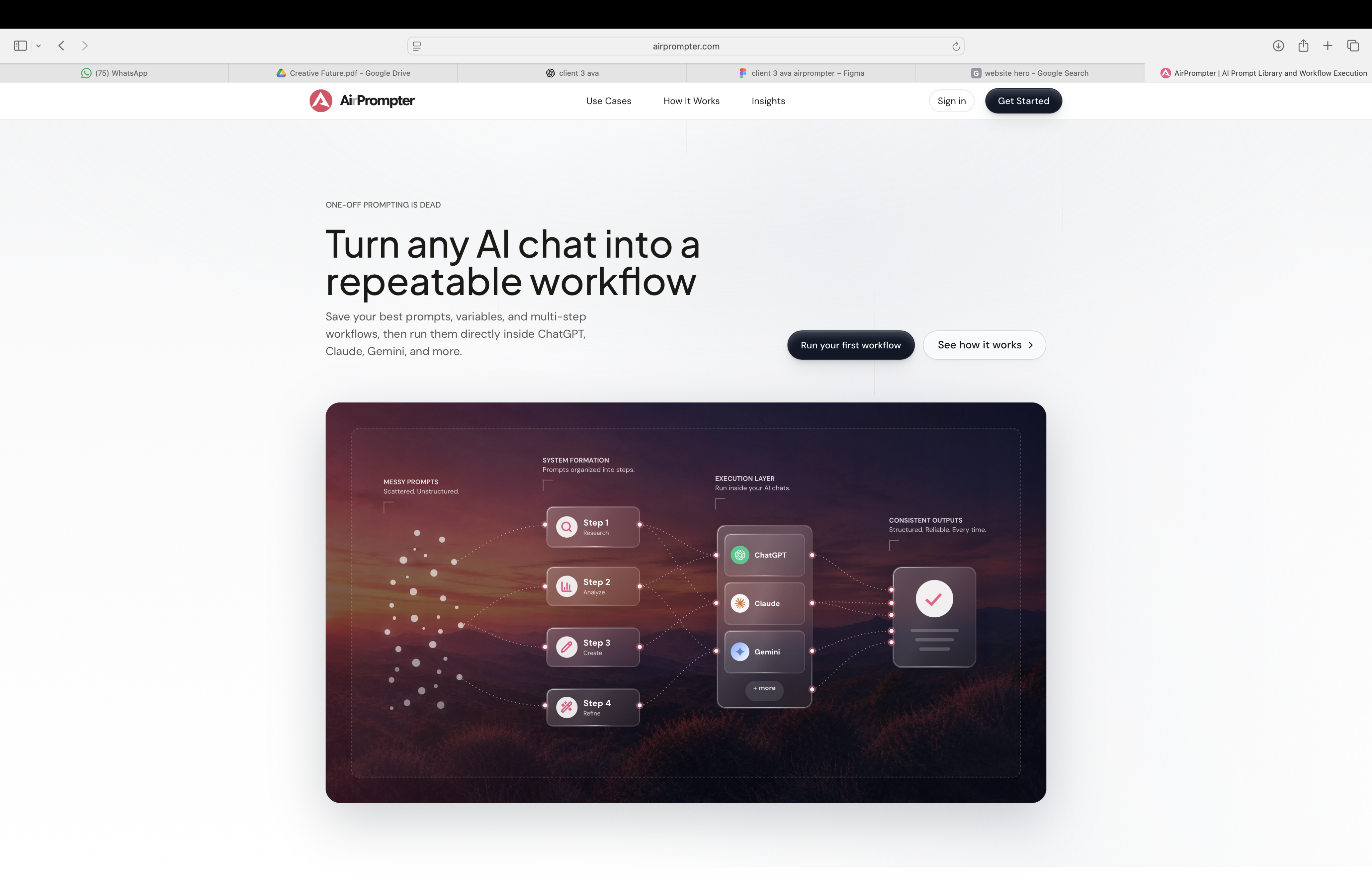
Table of Contents
0.2 Brand Overview 01
The Logo 02
Do's & Don'ts 03
Colors 05
Typography 06
Iconography 07
Applications 08
Brand Overview
Brand Overview
1.1About AirPrompter
AirPrompter represents a modern and intelligent approach to AI interaction design. The identity system is built around clarity, adaptability, and workflow-driven thinking, creating a visual language that feels minimal, scalable, and creator-focused.
The refined branding balances structure and flexibility to support digital experiences across product, marketing, and platform environments.
Modern AI workflows,
simplified.
Brand Attributes
- Intelligent
- Minimal
- Workflow-driven
- Creator-focused
- Scalable
- Modern
The AirPrompter identity system is designed to feel clean, intelligent, and scalable across modern digital experiences.
The Logo
Wordmark Guide
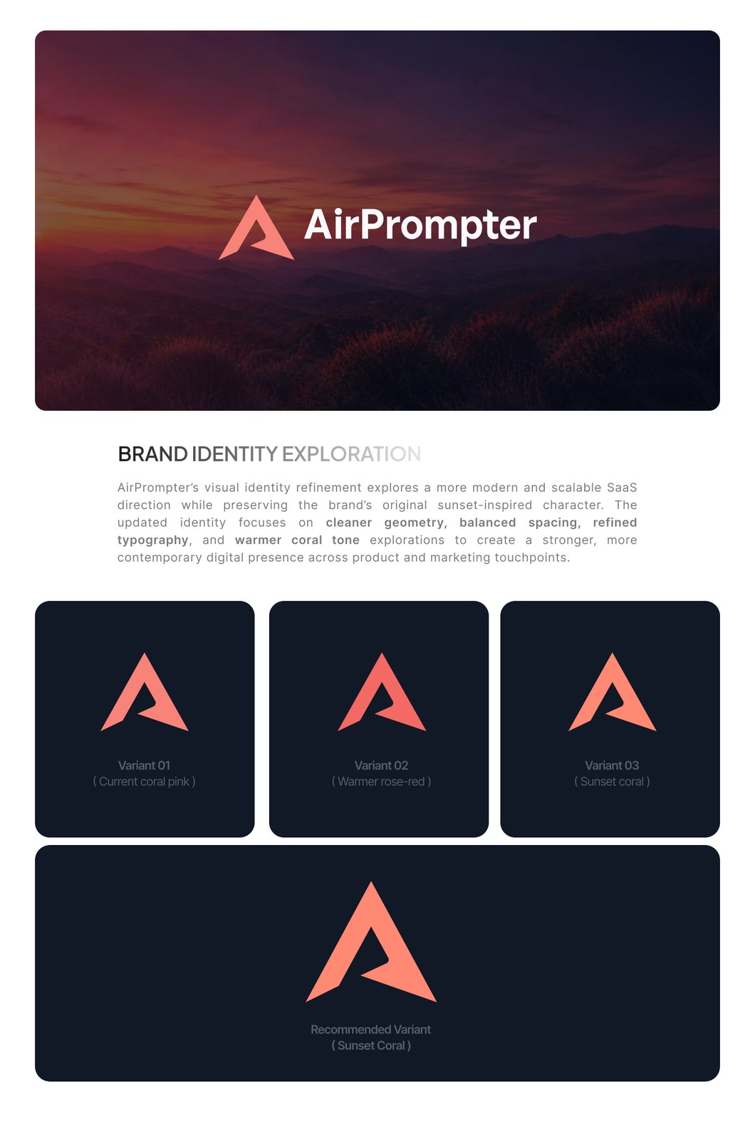
2.0Approved lockup

Font audit
The supplied PDF stores the wordmark as a Type3 vector font resource named /F1 with no BaseFont or recoverable family metadata. Use the approved lockup artwork for exact reproduction instead of rebuilding the wordmark from live text.
Use the artwork
Use the approved lockup asset. Do not recreate it with Plus Jakarta Sans, General Sans, Inter, or another substitute font.
Preserve spacing
Keep the mark-to-wordmark spacing, vertical alignment, and optical balance from the approved lockup.
Keep contrast simple
Use coral plus deep navy on light backgrounds, or the reverse white treatment on dark editorial imagery.
Escalate font changes
If a source font is recovered later, update this guide and replace generated assets in one pass.
Logo Refinement
2.1The AirPrompter logo was refined to improve clarity, balance, and scalability while preserving its recognizable visual identity.

Primary Logo
2.2The primary AirPrompter logo is designed for clarity, scalability, and digital-first applications.

Logo Spacing
2.3To maintain clarity and visibility, sufficient spacing should always surround the AirPrompter logo across all applications.
The minimum clear space is determined by the internal counter shape of the symbol.
Always preserve this protected area to ensure visual consistency and recognition.

Minimum Size
2.4The AirPrompter logo is optimized for clarity and readability across both digital and print applications. To maintain visual consistency and brand recognition, the logo should never appear smaller than the recommended minimum size.
For digital applications, the minimum recommended size is 24px in height. For print applications, the logo should not be reproduced below 10mm in width.
Monochromatic Version
2.5The monochromatic logo versions are designed for applications where full-color reproduction is not possible or practical. These variations ensure the AirPrompter identity remains clear, recognizable, and consistent across light and dark environments.

Correct Use
2.6The AirPrompter logo should always maintain strong contrast, clarity, and visibility across all brand applications. Approved background combinations help preserve readability while ensuring a consistent visual identity in both digital and physical environments.

Logo Do's & Don'ts
Do's & Don'ts
4.1To maintain consistency and recognizability, the AirPrompter logo should always appear in its approved form across all digital and marketing applications.
Primary Primary

Do's & Don'ts
4.2- Do not stretch or distort the logo
- Do not apply text effects/ filters
- Do not use colors outside of the color palette
- Do not use different fonts

Colors
Color Palette
5.1The AirPrompter color system is designed to support modern AI-driven digital experiences through a balance of bold primary accents and neutral supporting tones.
The primary palette establishes strong brand recognition and visual contrast, while the secondary palette provides flexibility, clarity, and consistency across interfaces, marketing assets, and product applications.
Primary
Coral Pink
- RGB
- 248, 131, 121
- HEX
- F88379
- CMYK
- 0, 47, 51, 3
Primary
Deep Navy
- RGB
- 17, 24, 39
- HEX
- 111827
- CMYK
- 56, 38, 0, 85
Secondary
Slate Blue Grey
- RGB
- 55, 65, 81
- HEX
- 374151
- CMYK
- 32, 20, 0, 68
Secondary
Soft Grey
- RGB
- 235, 236, 240
- HEX
- EBECF0
- CMYK
- 2, 2, 0, 6
Secondary
Off White
- RGB
- 249, 250, 251
- HEX
- F9FAFB
- CMYK
- 1, 0, 0, 2
Typography
Primary
6.1Plus Jakarta Sans
Plus Jakarta Sans is the primary typeface of the AirPrompter identity system. Its clean geometry, balanced proportions, and modern character support a clear and scalable visual language across digital platforms.
The typeface is primarily used for headlines, hero messaging, brand communication, and key interface elements to maintain strong hierarchy, readability, and consistency throughout the product experience.
Recommended weights:
- Bold
- Semibold
- Medium
UPPERCASE
A B C D E F G H I J K L M N O P Q R S T U V W X Y Z
LOWERCASE
a b c d e f g h i j k l m n o p q r s t u v w x y z
NUMERALS
0 1 2 3 4 5 6 7 8 9 1/4 1/2 3/4 ① ② ③ ④ ⑤ ⑥ ⑦ ⑧ ⑨ ⓪
PUNCTUATION
# % & " ' ^ ° * ! ¡ ? ¿ @ ( ) / | ¦ \ [ ] { } ‰ § ¶ © ® TM • · ... - — _ . , ; : ... < > « » ‘ ’ “ ” „
SYMBOLS
∫ Δ Π Σ √ μ π + - × ÷ = ≠ > < ≤ ≥ ± ≈ ~ ¬ ∞ ↑ → ↓ ←
Secondary
6.2Inter
Inter is the secondary typeface used throughout the AirPrompter product ecosystem. Optimized for digital interfaces, it provides excellent readability across UI components, navigation, body text, and supporting content.
Its neutral and functional design ensures consistency across web, product, and marketing experiences.
Recommended weights:
- Regular
- Medium
UPPERCASE
A B C D E F G H I J K L M N O P Q R S T U V W X Y Z
LOWERCASE
a b c d e f g h i j k l m n o p q r s t u v w x y z
NUMERALS
0 1 2 3 4 5 6 7 8 9 1/4 1/2 3/4 ① ② ③ ④ ⑤ ⑥ ⑦ ⑧ ⑨ ⓪
PUNCTUATION
# % & " ' ^ ° * ! ¡ ? ¿ @ ( ) / | ¦ \ [ ] { } ‰ § ¶ © ® TM • · ... - — _ . , ; : ... < > « » ‘ ’ “ ” „
SYMBOLS
∫ Δ Π Σ √ μ π + - × ÷ = ≠ > < ≤ ≥ ± ≈ ~ ¬ ∞ ↑ → ↓ ←
Iconography
Icon Set
7.1The AirPrompter icon system is built around clarity, simplicity, and usability.
Using clean outlines and minimal geometric forms, the icons maintain a modern and lightweight visual language across the platform.
The consistent stroke style and balanced proportions ensure readability across interfaces, from dashboards and workflows to navigation and utility actions.
Designed for digital-first experiences, the iconography supports scalability, accessibility, and visual consistency throughout the brand ecosystem.
Applications
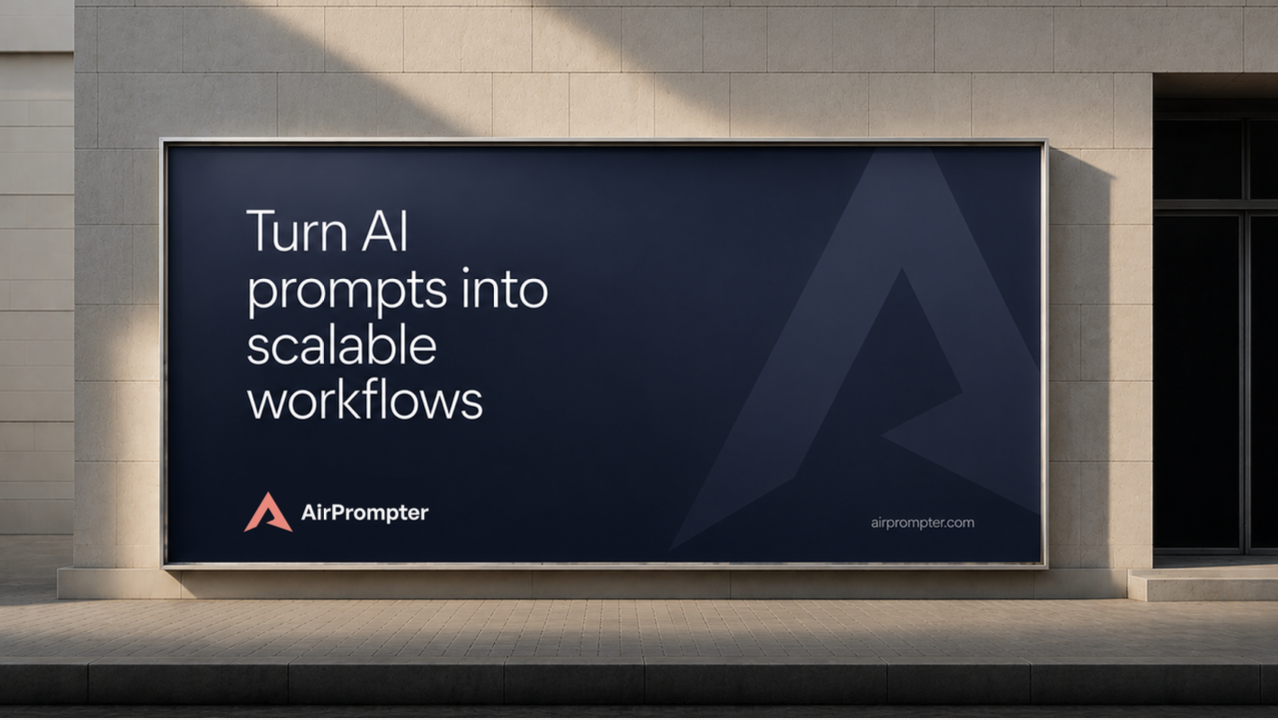 Billboard Application
 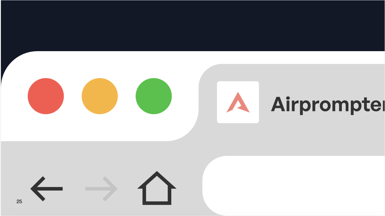 Browser Application
 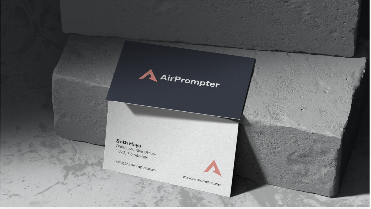 Business Card Application